Redesigning The Guidebook
I’ve been working on guidebook.hdyar.com for years, now. It’s my longest running academic project, and something of a repository for various class lessons, notes, and resources.

This ended up being a very large effort.
While primarily about Unity development, the purpose of the guidebook is not content related (“be a Unity resource”) The objective is user-defined: It’s a resource for my students. (“Here’s how to do that thing I see student’s needing”).
It’s also a repository for my flipped-classroom lectures that allows students to get these resources later, after the LMS is closed or after they graduate. Plus, I can update pages.
All of this means that the content is not created with a single goal in mind. I couldn’t write it as a book, with a single ordered learning path from start to finish. The content is a jumbled assortment of information that is useful to various skill levels, learning styles, and domains.
It finally stopped being “fine” and started being consistently difficult to find things. Let’s fix it!
Design Research
As always, I start by assuming my assumptions are wrong (hmmm), and try to validate or reject them. Design research time.
I constantly observe my students using the guidebook. For this redesign, I simple did so intentionally, taking notes. I also did some very informal ‘interviews’, asking some follow-up questions aobut what the students were thinking when they couldn’t find something.
Having constant access to a room full of your intended user profile is quite useful! I’m spoiled as a designer.
Observations
Students basically never used the navigation sidebar, Instead, they would use the search feature. When they did use the sidebar, they would unfold most categories semi-rendomly and scan through all the items until they found what they were looking for.
Whether through using the search function, or manually searching via scanning themselves, search has become the primary way to find articles. This is frustrating, and requires the user know what they are looking for. Any discovery flow takes a backseat.
Takeaways:
- Search is still a must - I don’t want to break a habit
- Article titles are important. They should be descriptive and unique
- The thin navbar encourages shorter (and less descriptive) article titles
- Having navigation in collapsing sections leads to uneccesary clicks and hidden information
- Designing for “Scan-ability” (AKA “human powered search & summary”) is a high priority
A Problem of Taxonomy
Most of the content exists in a multiple conceptual categories. Consider an article on how to switch scenes in Unity. This is a beginner concept, about writing code with C#, and a quick reference more than a lesson. This could go in the “Programming”, “Unity”, or “Toolbox” sections easily.
Which category? My constant pain. How to organize content that can fit in multiple buckets so easily? The right answer to this question is that there is no right answer, we need to change the situation so this question stops getting asked.
Problem 1: Unclear High Level Categories
If we’re guessing where it goes, users will guess where it goes too, and because they are users, they will always guess wrong.
Design Rule no. 228: Users are unlucky like that.
The fact that they have to consider what category something is in at all is a failure.
Problem 2: Discoverability
My student’s don’t know what all is in the guidebook! This “research” hasn’t come from observation research or clickthrough analytics. It comes from my own anecdotes and annoyances.
A student asks me how to import textures or such into Unity, and I reply by sending them a guidebook link. “Oh, I didn’t know you had this. Thanks!”
It would (selfishly) benefit me if the students were able to discover resources before requesting them. How many students are finding bad (incomplete, out-of-date, poorly explained) resources on YouTube instead of utilizing their professor? At the college they pay for? I am on of their best resources, and the more they use my asynchronous materials, the more comfortable they are asking my for [synchronous] help. That’s a good thing!
The Solution
My solution is twofold: content reorganization and a complete website redesign.
Content Reorganization
How to remove category confusion? Consider the way one accesses information. Nobody goes to the guidebook for Unity or Programming help, they go for help on a specific thing (perhaps while using Unity or Programming). So let’s present more specifics to them, related to what they are doing.
I chose “What are you struggling with?” as the user-profile to design for. I want to serve all my students, but I want to serve and help the ones who feel like they are struggling the most. How are they thinking about their problems? If the answer is “Unity”, then fair enough - but it never is, that’s too big. The answer is usually more like “Getting this 3D model working” or so forth. They are thinking about verbs, not software titles.
Organization Solution 1: Flatten Everything
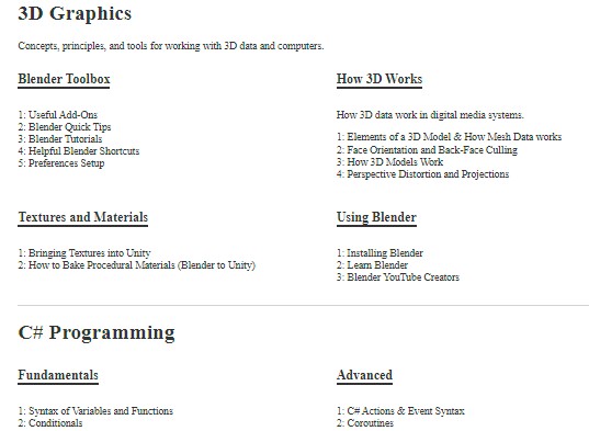
I flattened the taxonomy. First, I removed all high level categories that were the main cause of ambiguity (ie: no “Unity” or “All Programming” categories allowed). I worked the rest into a larger number of more descriptive categories. A new Virtual Reality, Code Architecture, 3D Modeling, etc. sections appeared - sensibly.
The top level categories are now just website sections, visual breaks to help one’s eyes scan quickly.

One can quickly jump past 3D graphics to get to C# programming, but the real categories are below each one.
Organization Solution 2: Consistent category layers
I decided that outer sections should concepts driven, and then action-driven, then tools.
The high level-layers are concepts, mid level layers are [usually] verbs, and then the articles. “With x, I am trying to do y”. Should bring them from category x into subcategory y. The important thing is consistency. (Here, is where I failed the most… but it is important!)
There are still lots of edge-cases that don’t fit (e.g. the ‘Advanced’ and ‘Fundamentals’ programming sections that actually correlate to flipped-classroom lectures). These edge-cases are for user profiles that are less important. I serve the struggling student landing on the homepage first, students looking for an assigned video lecture second.
There is still some challenges for organizing. When covering Unity Systems, for example, how the audio or animation system works should be in an ‘Audio’ or ‘Animation’ category of it’s own. They aren’t, because they would be the only articles there. This implies future reorganization as the site grows (and updating links again). I wish that weren’t the case, but oh well. I accept the compromise.
Organization Solution 3: More Descriptive Names
I started renaming articles to be more descriptive. This is to support scanning of titles to find what they need.
‘Setting up Git & Unity’ -> ‘Configuring Git with a Unity Project: Setup Checklist and Walkthrough’
Website Redesign
Website Solution 1: Dense and Scannable Home Page
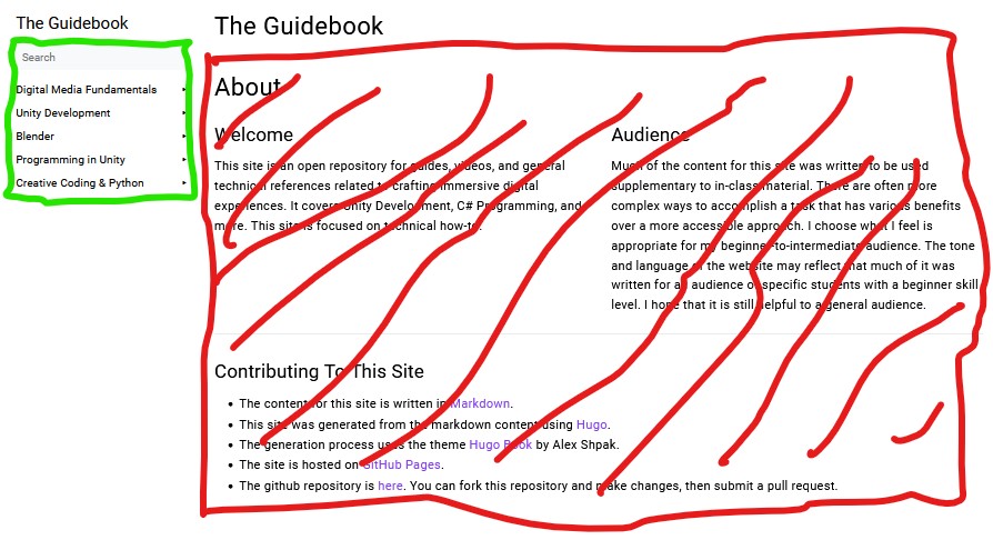
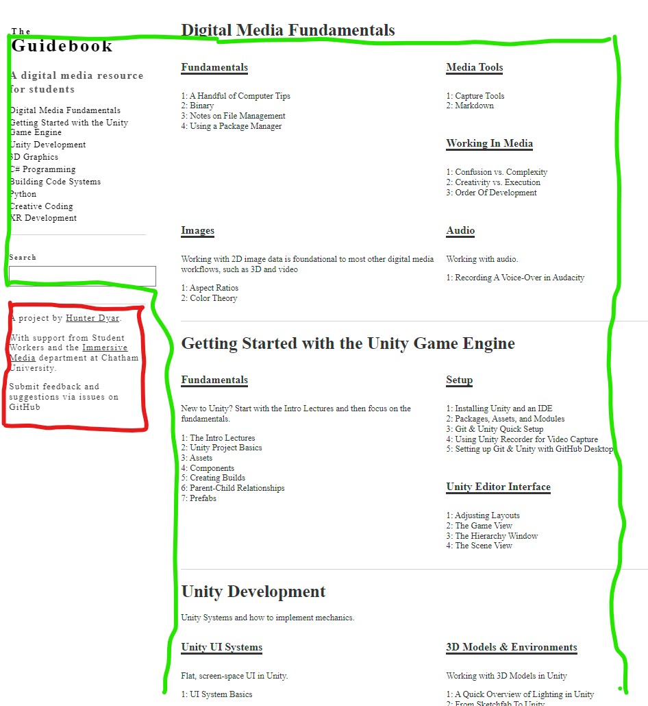
The new home page is no longer a ‘Welcome’ message that nobody reads (on right). Virtually all of the users on the home page were navigating by search or by navigation bar (on left).
This is the old guidebook design, the ‘book’ Hugo theme.

Left green box, no slashes: The only part that actually matters to 99% of visitors. Right Red box, slashes: none of this needs to be here.
Turn the entire home page into what users want: navigation. Every title of every article is visible here, allowing users a new and familiar way to search: the find feature (ctrl+f) in the browser.
This flattened and dense design increases discoverability. The words will appear on the page! Projected at the student’s eyeballs. There’s even a small chance that they might read them.
As described above, there are still some confusing categories, but the improvement is massive.

The same sections as the old home page in the same colors. There’s a lot more content on the home page.
Scrolling > Clicking, so long as the page is highly scannable. The left bar will jump you to the section on the same page.
One new problem, for my one-off articles (a single audio-related page), Instead of ‘bonus content’ that feels like an extra that it’s there at all, it now feels like ‘missing content’ that it has a categories that is so sparse. My solution to this design issue? Nothing! This is fine. The project is free, funded by my research and not visitors. Or: Perhaps I have some more writing to do.
Website Solution 2: Remove Everything Useless
Changing the home page also let me remove odd and out-of-place category landing pages. Fake pages that represented a folder structure of the site, but didn’t represent any information or content.
The theme of the site, and how Hugo works, directed my design - not the content. That doesn’t lead to good design! The new entirely bespoke theme can be what I want, and not anything else.
Website Solution 3: 404 Page + Redirecting Lost Users
Pushing it live means breaking links. So, so, so many links. I have to update all of my course websites, YouTube video descriptions, and LMS course pages. More than anything, this is why I procrastinated on the redesign - and why I can only do this during the summer, between semesters.
Next, I thought about the 404 page you will see when clicking an old link. This will inevitably happen. How can this be improved?
Well, the best case is to just redirect the user! Second to that, a ‘This page has moved" page that catches the old links and sends the user back to the content they were looking for.

I opted to do a “This page has moved” instead of an automatic redirect for a simple reason: I will rather just find all the out-of-date links and update them! An automatic redirect (while perhaps better for archive.org with metadata) is a crutch that will bite me eventually.
Knowing that I am still going to miss some links, I added a link to a search results page that uses the missing url slug as the search content. This will appear if it can’t find the missing page. Giving the user direct actionable options is better than just going “uh oh sorry”.
Redesign Process
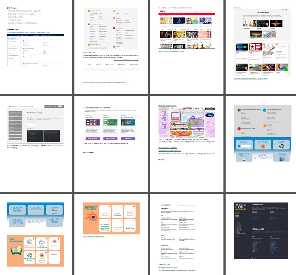
For website design research, myself and a student worker assembled a document of many different high quality resource websites. We identified the layouts that fit the abstract design goals, and I used them as reference to sketch a design. The student and I also sketched some ideas ourselves.
I always do my first sketches on post-it notes. The small size forces me not to get stuck on details.

I wrote the new Hugo theme from scratch, using the tachyons css framework. I’m not a big fan of doing web design, and I considered the entire process a real pain in the butt. (Are we still going responsive design? Uhg!)
With the help of the sketches and reference imagery, I gradually molded the site into shape. Is it done? Good? Finished? No! Lot’s of rough spots, especially around search result design. But, as talented designers always ay: “eh, it’s good enough for now”.
More importantly, It’s August, and this has to go live before the semester starts. “It’s not done when I’m happy, It’s done when the deadline arrives”
I got search working using fuse.js, as described in this github gist (that Hugo links to in it’s documentation). I removed JQuery from it, because why import 80+ kb of javascript just to do (checks notes) wrappers for built-in javascript features.
Deployment
My summer student worker and I pushed it live on a Monday morning. Then we started the laborious process of finding all my old links. I gave them temporary access to newly cloned course pages as a TA (No student data/grades on these, the semester hasn’t started yet), and I worked through the rest.
For the ’this page has moved’ page, I added a new metadata option. For any page, I can indicate it’s “old” url. This needs to be done manually.
I generate a json file with the old and new urls mapped. With this, the 404 page can load that search if the is a missing page, or a moved page, and display content accordingly.
The Hugo Layout for the custom Output Format. All of the string replacing is just to normalize what we will paste into the metadata, so it’s less finicky.
{{- $.Scratch.Add "moved" slice -}}
{{- range .Site.RegularPages -}}
{{ $p := .}}
  {{ $old := .Page.Params.oldlink }}
  {{ with $old }}
    {{ $old = replace $old "https://guidebook.hdyar.com/" ""}}
    {{ $old = replace $old "guidebook.hdyar.com/" ""}}
    {{ $old = replace $old "www." ""}}
    {{ $old = replace $old "http://" ""}}
    {{ $old = replace $old "https://" ""}}
    {{ $old = strings.Trim $old "/"}}

    {{- $.Scratch.Add "moved" (dict "old" $old "relpermalink" $p.RelPermalink) -}}
{{ end }}
{{- end -}}

{{- $.Scratch.Get "moved" | jsonify -}}
Getting this working also requires updating the site config to deal with the new output formats.
In the hugo config.yaml:
[outputFormats.Moved]
MediaType = "application/json"
BaseName = "moved"
IsHTML = false
IsPlainText = true
notAlternative = true

[outputs]
home = ["HTML", "RSS", "JSON", "moved"]
And, some simple javascript to check the generated json file:
async function movedPage(moved){
        var response = await fetch("/moved.json");
        if(!response.ok){
            throw new Error("unable to grab page move data. "+response.statusText);
        }
        var movedPages = await response.json();
        var newPage = movedPages.find(e=> e['old'] === moved);
        if(newPage) {
            document.getElementById("page-nf").hidden = true;
            var pm = document.getElementById("page-moved")
            pm.hidden = false;
            document.getElementById("here-a").href = newPage["relpermalink"]
            document.getElementById("here-b").href = newPage["relpermalink"]
            return true;
        }
        return false;
    }
Feel free to check out the theme on GitHub.
